Project 2
DHS Data Analysis Project: Colombia
The data used in this project was obtained via the Demographic and Health Services website, where they have population datasets for hundreds of countries. This particular dataset is survey data compiled in Colombia in 2015.
Q:Using the R script provided, split and sample your DHS persons data and evaluate the AUC - ROC values you produce.

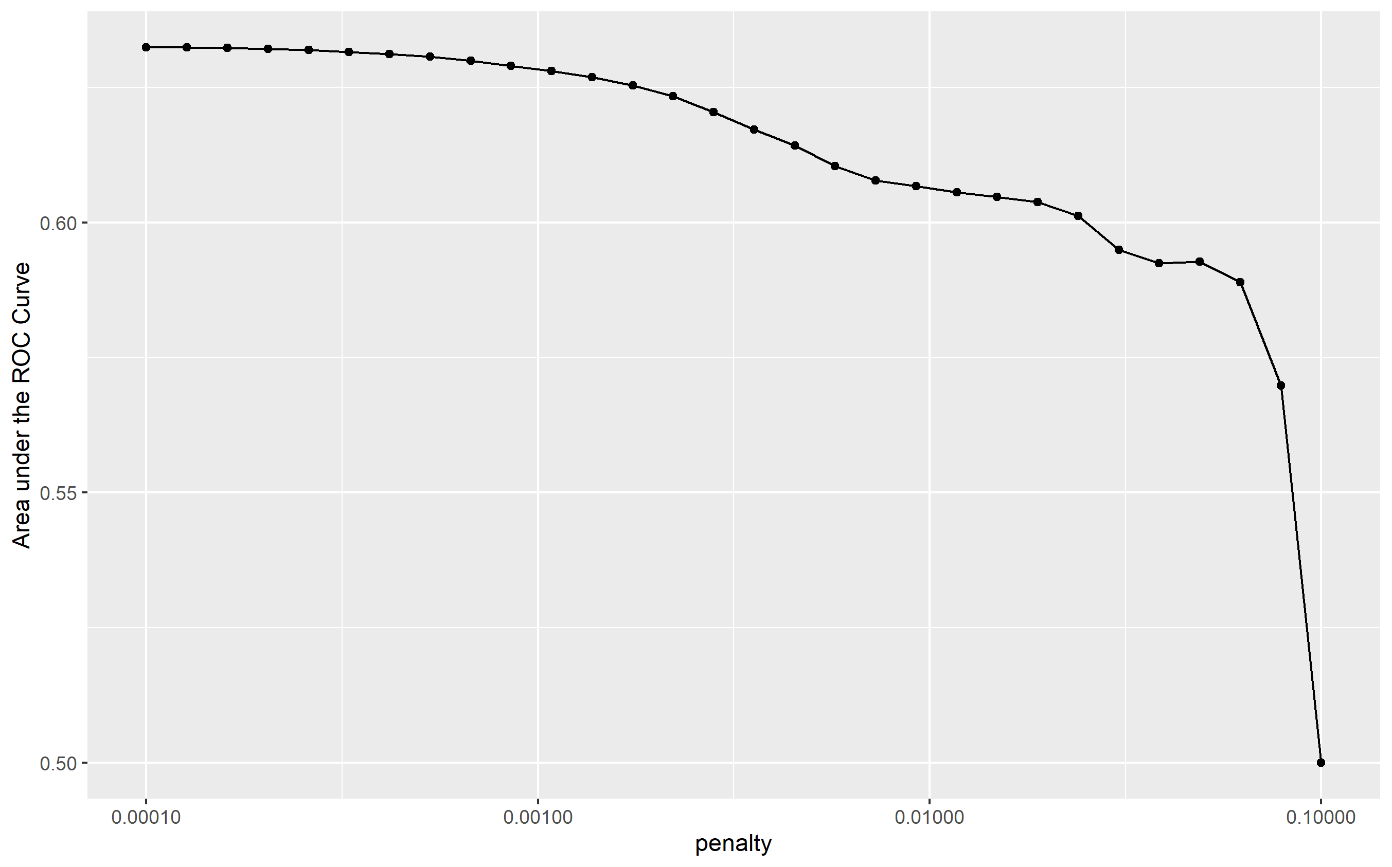
As seen in the graph above, the area under the ROC curve maintains a value of ~0.63 for the first 6 models, after which we begin to see a sharper negative slope. This means that the early models have about the same predictive power until about this point, where we see increasingly higher penalty values until a 0.1 penalty.
Q: Are you able to use the feature selection penalty to tune your hyperparameter and remove any potentially irrelevant predictors? Provide justification for your selected penalty value? Finally, provide your ROC plots and interpret them. How effective is your penalized logistic regression model at predicting each of the five wealth outcomes.

In order to identify any irrelevant predictors, I chose model number 5 from the first tibble in the image above detailing the lowest penalty values. This model has a penalty of 0.000259, and is situated toward the end of the string of data points to the left of the plot. Thus, while it has a penalty value that could lead to the identification of irrelevant predictors in the model, it also maintains an accuracy level that is consistent with the better-performing models. This way we preserve model accuracy while still predicting avenues to further refine the model for future performance.

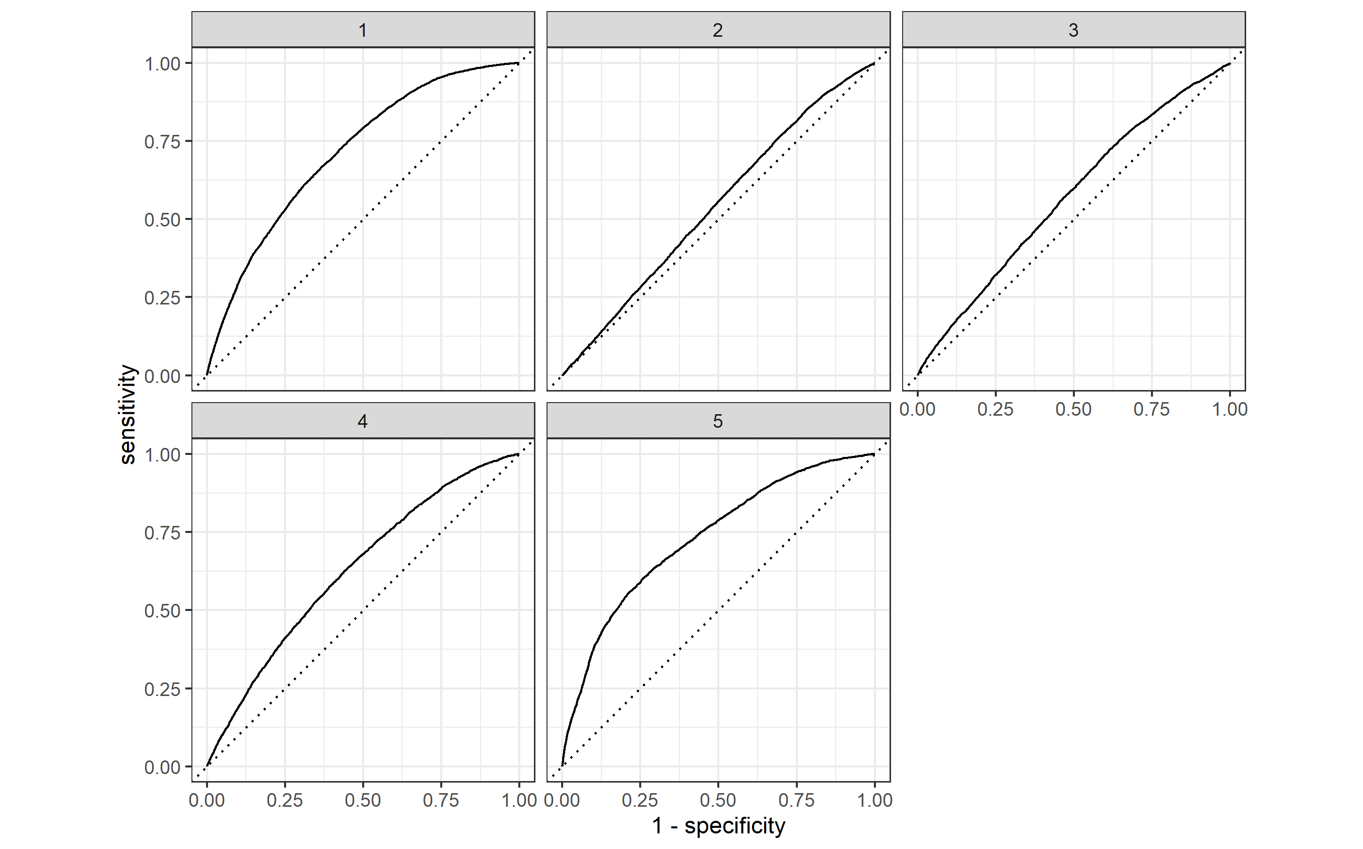
In the plots above, the accuracy of each model is shown by the solid bowed lines, whereas the dotted lines signify the predictive power of a random guess for each wealth outcome. From these graphs, it seems that model 5 is consistently able to predict the first and fifth wealth outcomes with a credibly high accuracy. Specifically, my model performs best on wealth groups 1, 4, and 5. These three graphs show the closest line curvature to a perfect 1.0 value for predictive power. The other wealth outcomes, 2 and 3, show predictions that barely edge out the random guesses for parameter sensitivity. However, all of the graphs remain either on or above the random-guess threshold, implying that there is at least some prediction occurring for each wealth outcome. Given that each value corresponds to a wealth tier, this model is particularly better at identifyng trends at the extremes of wealth levels in Colombia rather than in middle income groups.
Q: Using the R script provided, set up your random forest model and produce the AUC - ROC values for the randomly selected predictors, and the minimal node size, again with wealth as the target.

Q: How did your random forest model fare when compared to the penalized logistic regression? Provide your ROC plots and interpret them. Are you able to provide a plot that supports the relative importance of each feature’s contribution towards the predictive power of your random forest ensemble model?

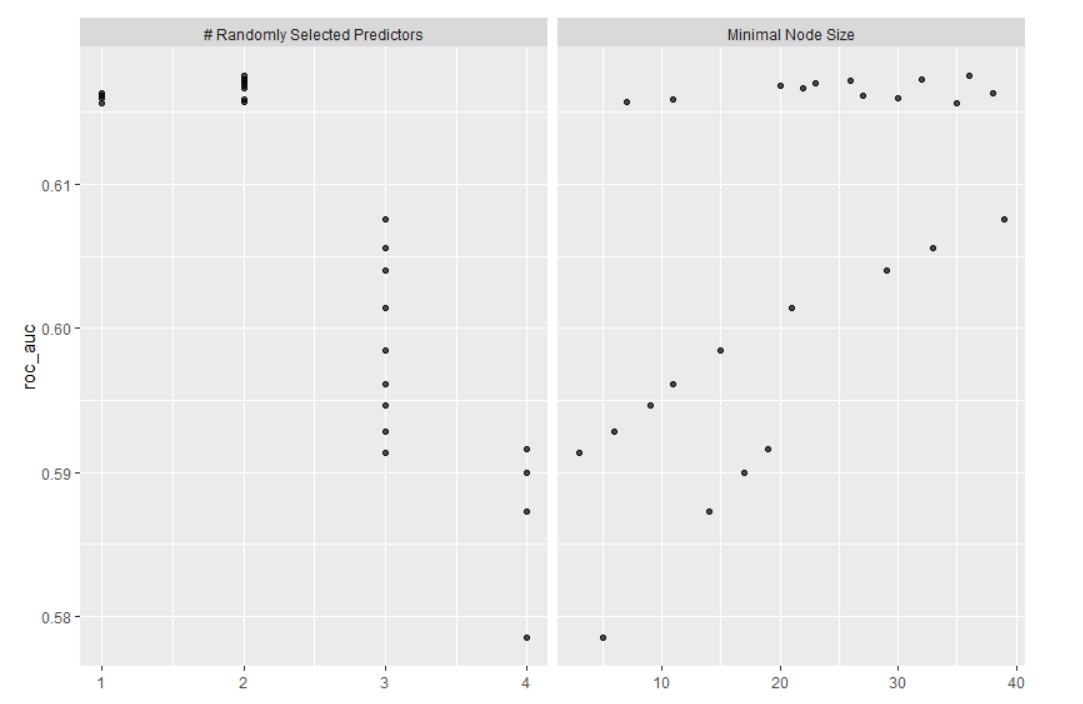
From the image above, it would seem as though the random forest performed slightly better on average than the linear regression. It contains both the best and the worst predictions, so they could end up canceling each other out.